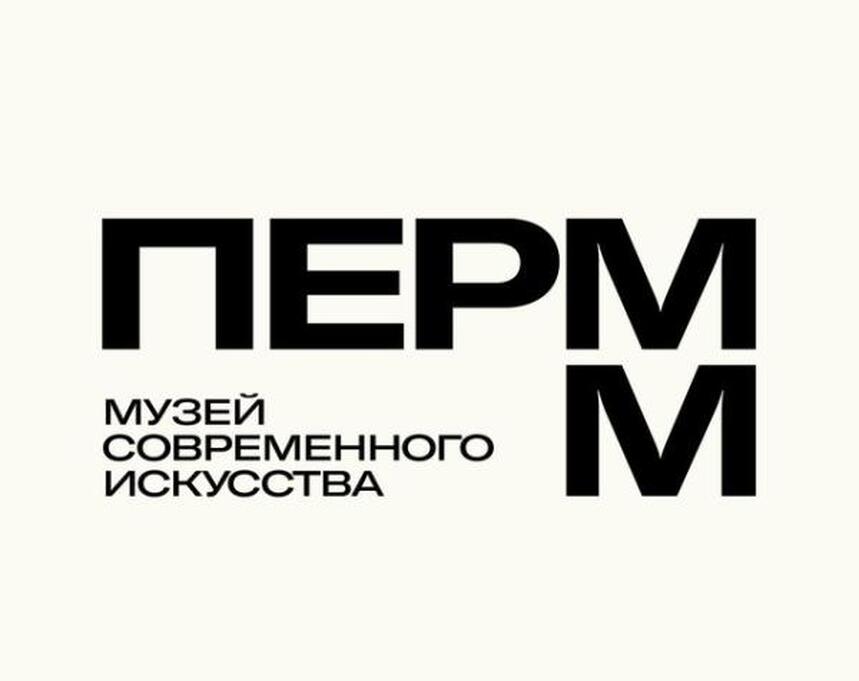
The Perm Museum of Modern Art has stepped into a new era with a striking rebrand, courtesy of Moscow-based designer Stefan Lashko. The museum’s former director, Nailya Allahverdiyeva, has praised the updated identity, calling it a seamless blend of the institution’s storied past and its forward-looking vision.
The new logo, now prominently displayed on the museum’s facade, website, and social media, marks a departure from its predecessor with a bold shift to Cyrillic script. The redesign, initiated under Allahverdiyeva’s leadership, was driven by the need for a cohesive brandbook to streamline the museum’s visual identity across exhibitions and projects.
According to Allahverdiyeva, the previous logo, designed by Dmitry Mordvintsev of ABC Design, was iconic but lacked a comprehensive branding system. “We had a great logo, but no brandbook,” she explained. “Every exhibition required custom design work, which slowed processes and increased costs.”
Lashko’s design introduces a minimalist yet dynamic aesthetic, anchored by a geometric frame inspired by the museum’s new home in the Mercedes Center. The logo’s key elements—a sharp angle and a curve—echo the building’s architectural contours, creating a visual harmony between the institution and its surroundings.
The updated logo also reimagines the museum’s acronym, PERMM, as a versatile container. “It’s a frame that can hold anything—‘Museum,’ ‘Cafe,’ ‘Theater,’ ‘Lecture Hall,’” Allahverdiyeva noted. “It’s flexible, modern, and perfectly suited to the museum’s evolving role.”
While the brandbook offers multiple color options, including a vibrant neon pink, the museum’s current leadership opted for a classic black-and-white palette. The reasons behind this choice remain unclear, but Allahverdiyeva expressed confidence in the design’s potential. “It’s light, transparent, and undeniably contemporary,” she said.
The decision to prioritize the Cyrillic version of the logo may reflect broader cultural shifts, including potential legislation restricting foreign-language signage. “It’s a pragmatic move,” Allahverdiyeva observed, “but it doesn’t diminish the logo’s impact.”
The rebrand comes at a pivotal moment for the museum, which has faced leadership changes and legal challenges in recent months. Allahverdiyeva stepped down in December 2024, and the search for a new director is ongoing. Despite these upheavals, the museum’s refreshed identity signals a commitment to innovation and growth.
“Letting go of the old logo was painful,” Allahverdiyeva admitted. “It’s tied to so much of the museum’s history. But change is inevitable. This new style has incredible potential—it’s a bold step into the future.”